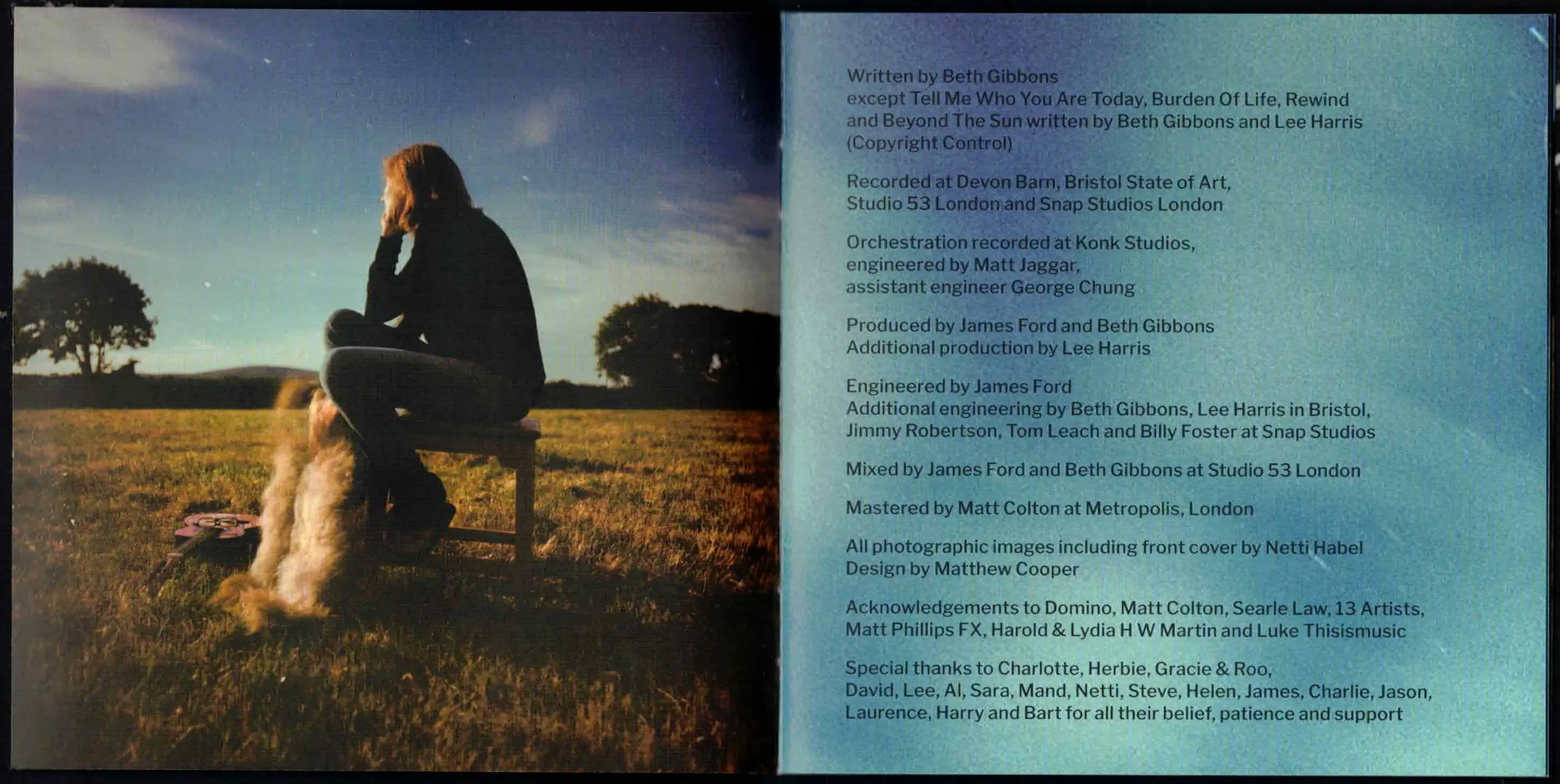
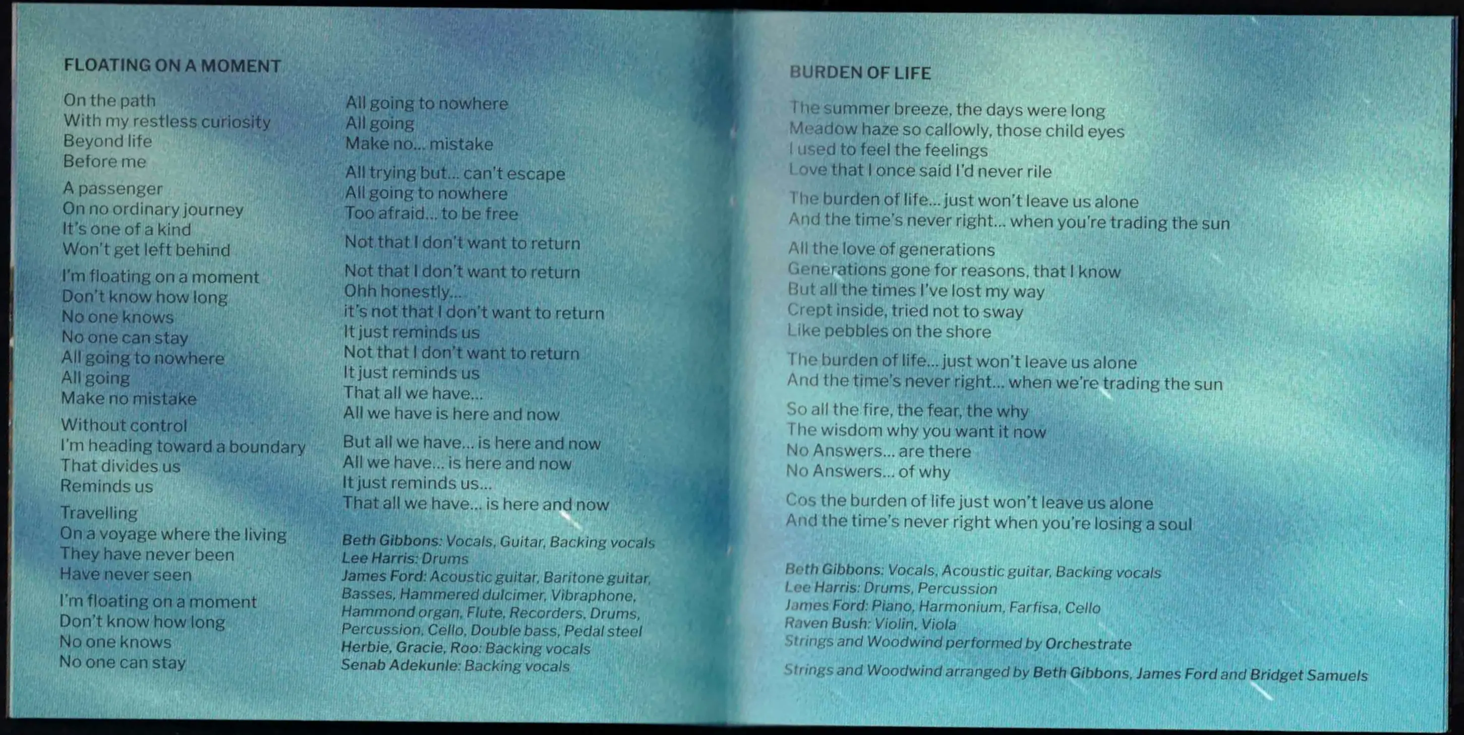
 There isnt much to say about this one, the colours are just gorgeous and the gradients so beautiful. Its soft and legible, which really compliments the ablum, which could be described similarly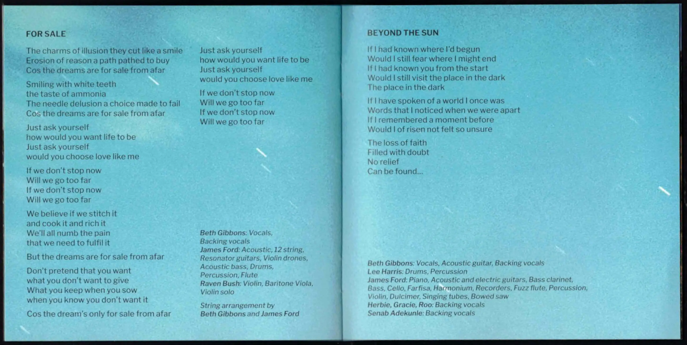
I have a fairly modest CD collection, and my favourite part of buying a new cd is the lyric booklet. Occasionally its just some extra artwork and credits(which is also appreciated), but sometimes I open the cover to find something absolutely gorgeous. Many of these booklets I remember opening and feeling actually viscerally moved by them, today I want to share the lyric booklets from my collection that I remember making me excited to play the cd.
1. bogstandard but beautiful
This category feels like an insult, but the covers here are really nice, they're not doing anything weird but they are perfectly legible and complement the album very well. Insanely competent covers in their own right which should be celebrated opposite the stranger booklets which will follow.
Lives Outgrown - Beth Gibbons - designed by Matthew CooperThere isnt much to say about this one, the colours are just gorgeous and the gradients so beautiful. Its soft and legible, which really compliments the ablum, which could be described similarly
Hellmode - Jeff Rosenstock - designed by Jeff Rosenstock and illustraded by Dave Alegre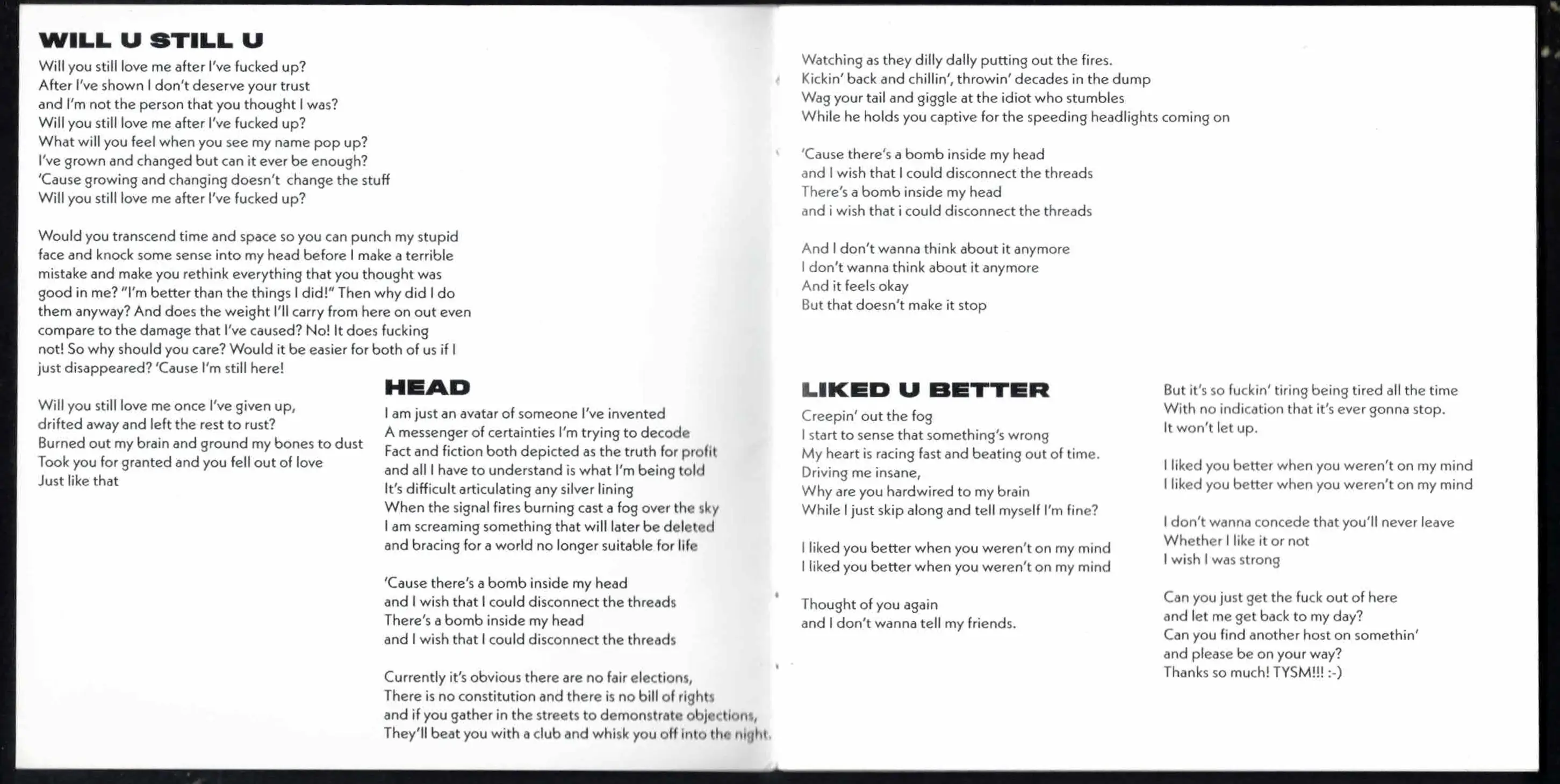
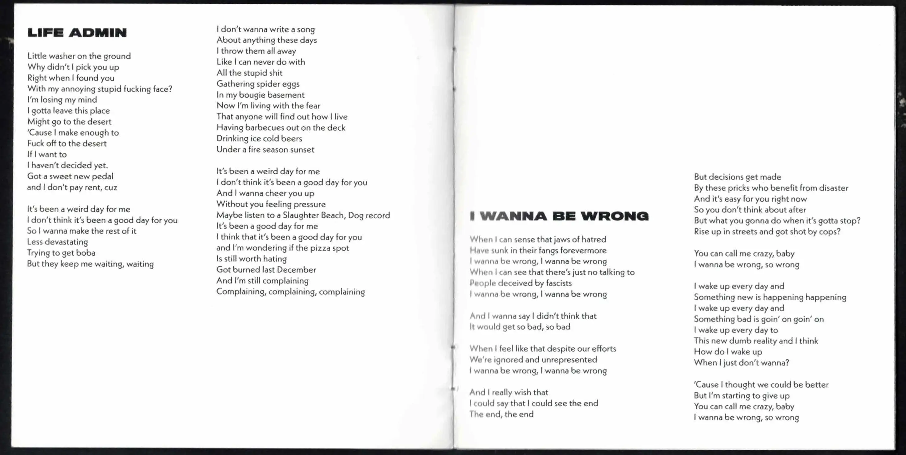 This layout has a Kabel-esque font(might even be Kabel, but am unsure) which I really like, its geometric but has these little funky bits like the lowercase g being made of 2 cirlces. Other than that, its very functional, and I can see a more out there layout fitting the album but the stripped down-ness of this isalso just as perfect. I can't articulate exactly why I keep returning to this booklet, its just really pretty to me, its definitely the booklet I use the most as a thing to follow along to the music with.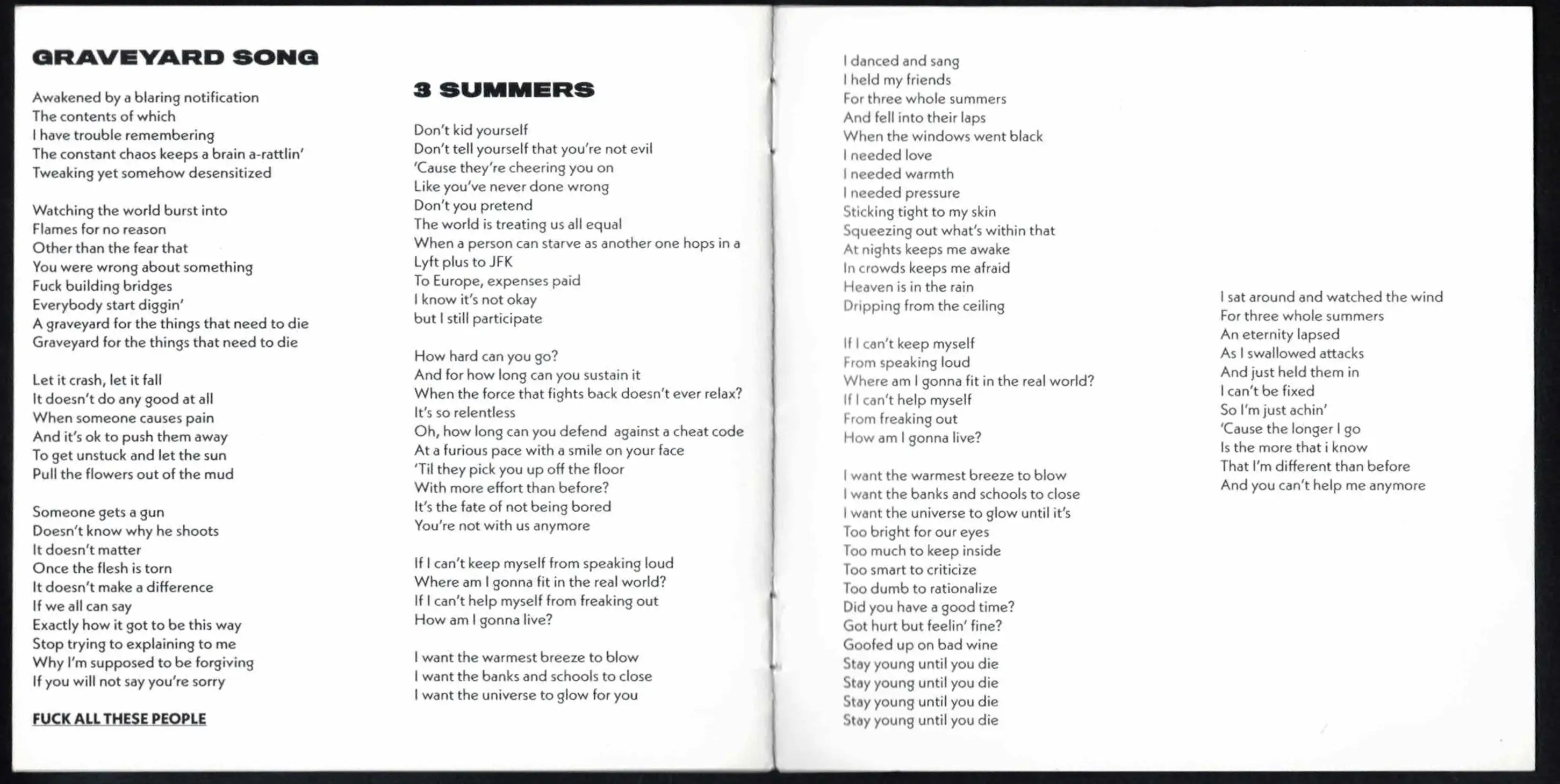
2. quirky little details
these booklets look normal on the surface, but contain little details which are quite strange actually, these booklets might not evoke the same sense of wonder or confusion that I felt viscerally opening the covers in any category, but they do contain the most I could write about because of their hidden complexities.
polygondwanaland - King gizzard and the Lizard Wizard - designed by Jason Galea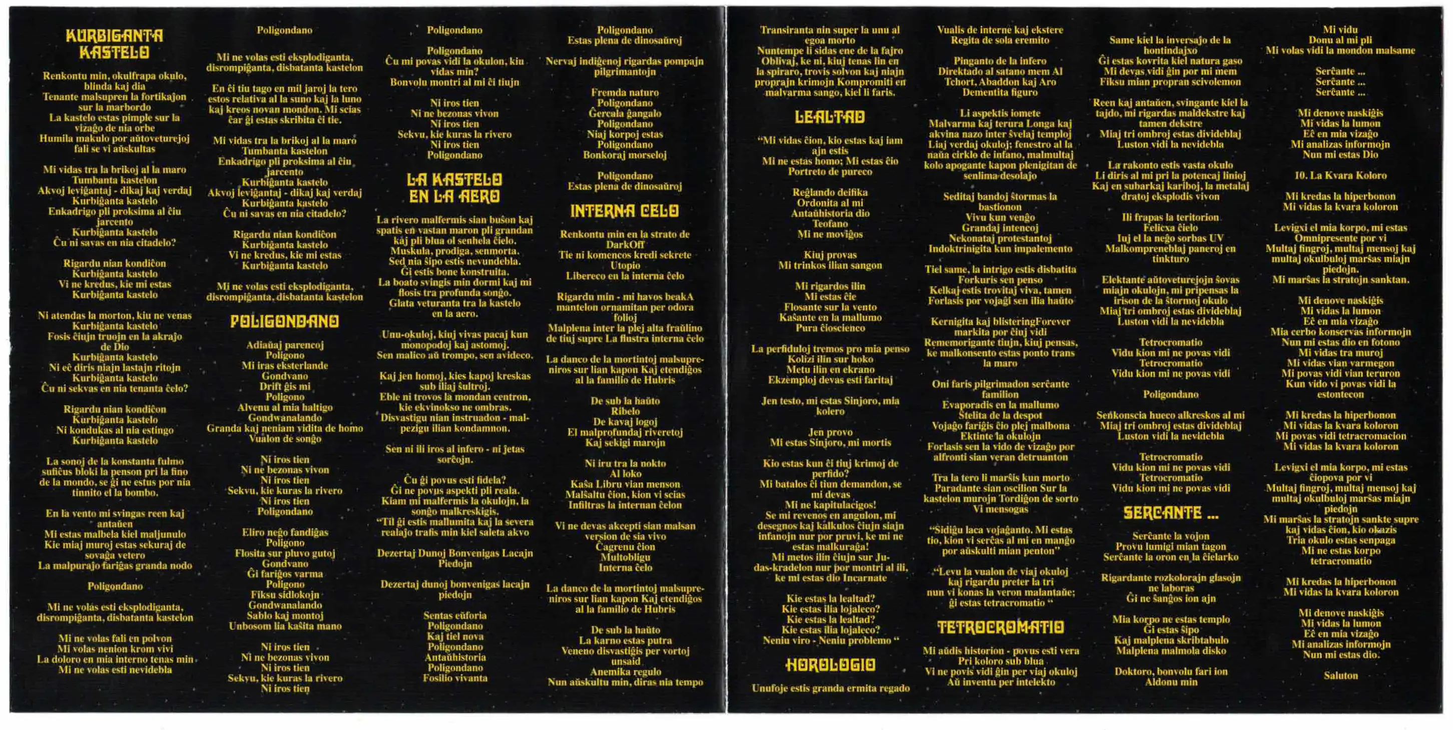 This is a free album, so I don't know entirely why I have a cd of it, but I do. The first thing I noticed about this lyric booklet however, is that it is in a language I could not identify. This language turned out to be esparanto, the conlang designed to be an average of many european languages to be "universal". This is incredibly funny to me.
Hail to the Thief - Radiohead - designed by Stanley Donwood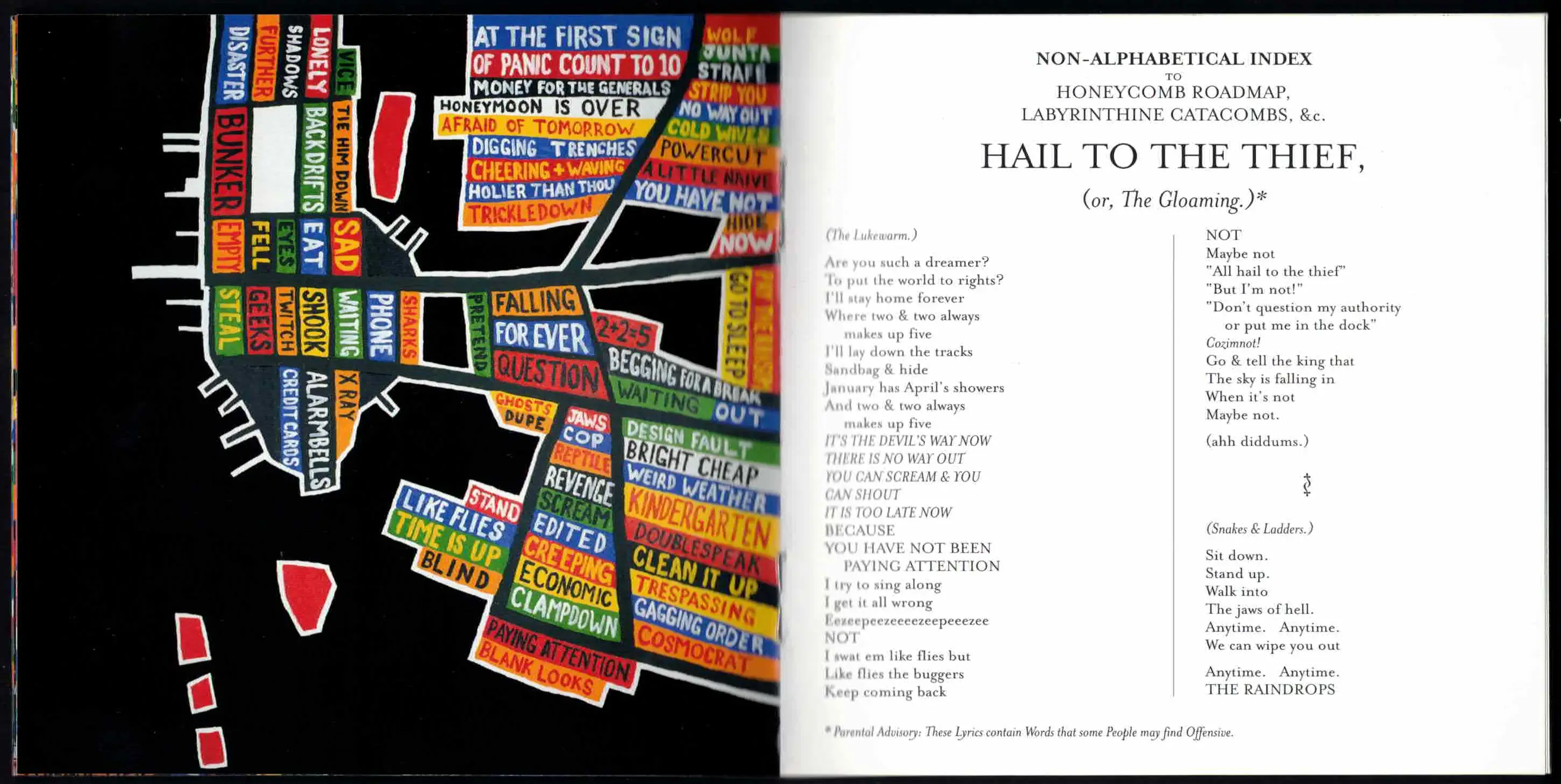 The first few pages of this book contain words imposed onto maps, reminiscent of some of Paula Scher's recent works. It would be logical for the rest of the booklet to follow suit, but half way through, it turns into what might seem to be a standard lyric booklet set in a gorgeous but unremarkable font made by Zuzana Licko for Emigre type foundry(this is not an insult, they just have many flashier fonts that could also work here, like Jonathon Barnbrooks Mason or Matrix by Zuzana Licko).
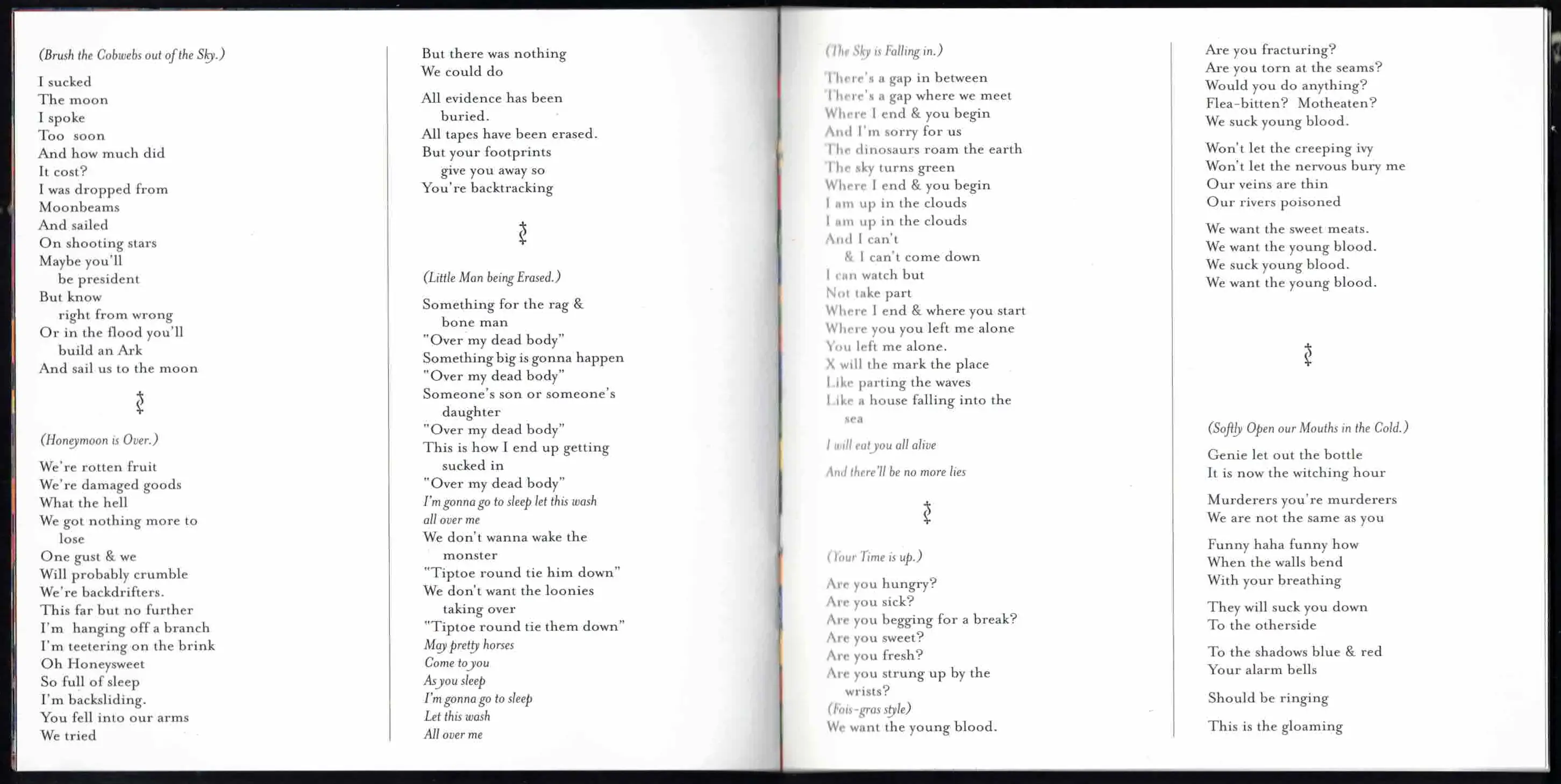 What makes this booklet so interesting to me is what I call the "flavour text", a term I borrow from trading card games like Magic, the Gathering. All the songs have alternate titles and are reffered in the booklet by those alternate titles, there is also extra text strewn around and different verses are formatted differently. Theres something very victorian about it all that I find gives it a sort of romantic alice in wonderland-esque intrigue. The serif font also marks an interesting return to the analogue that reflects the instrumentation of the album.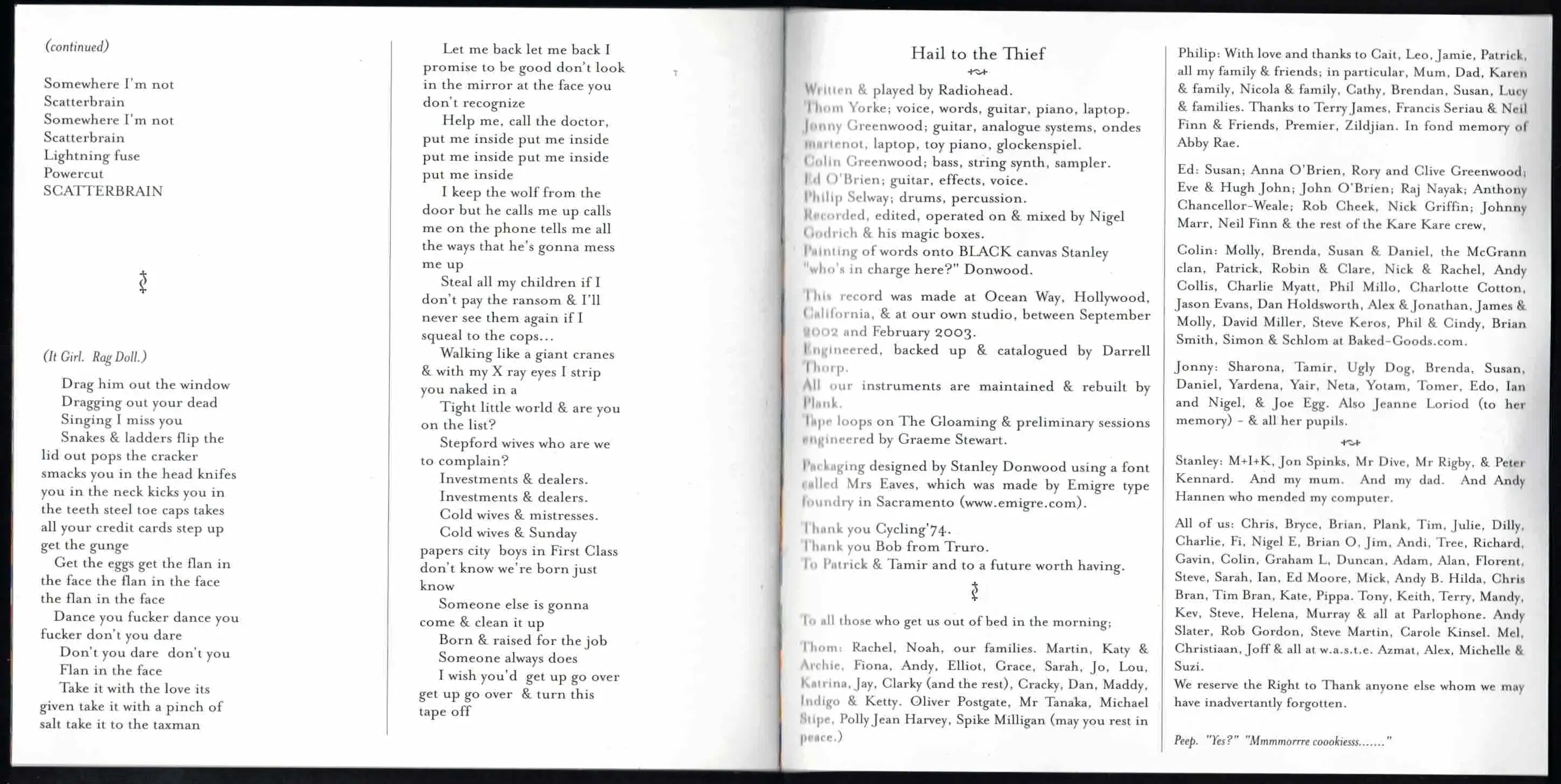
IGOR - Tyler the Creator - designed by Tyler Okonma, Darren Vongphadkdy, and Phil Toselli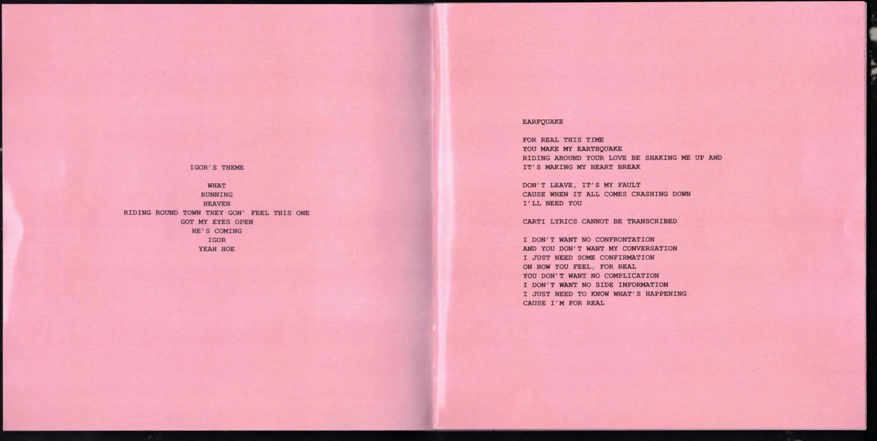 I'm actually undecided on wheter I actually like this booklet, but theres so much going on here that I had to include it. It seems to be set entirely in courier, which is a font I really like - the specific thing I like about monospace fonts is that they create their own grid, so it would follow that this booklet is nicely organised but this is absolutely not the case.
 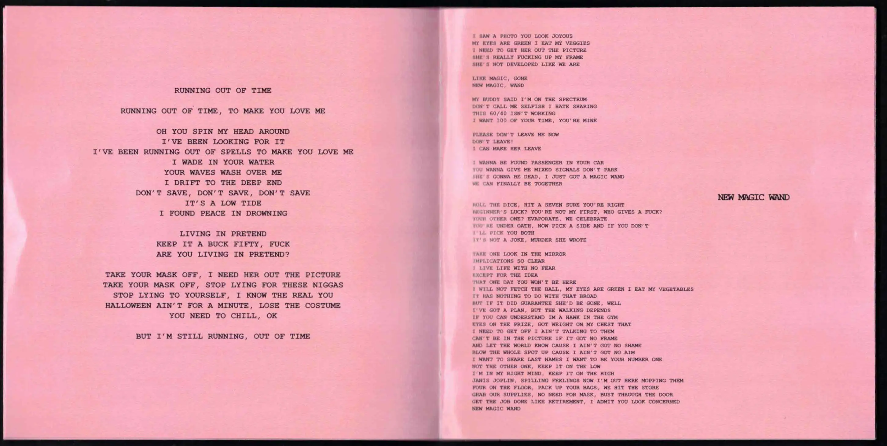 The formatting here is all over the place, some titles have some really fucked up kerning(new magic wand feels particularly squished), some songs are center aligned, absolutely obliterating the neat grid that makes monospace fonts so appealing to me, text is resized willy nilly to fit on the page with seemingly no regard for the size of the lyrics of the other songs. My favourite little detail here is that the geust verses are replaced with a note saying that they "could not be transcribed". This booklet is fucking weird I hate it but something draws me to it. It makes a great pairing with an iconic lyric booklet which we will get around to later(no prizes for who guesses what it is).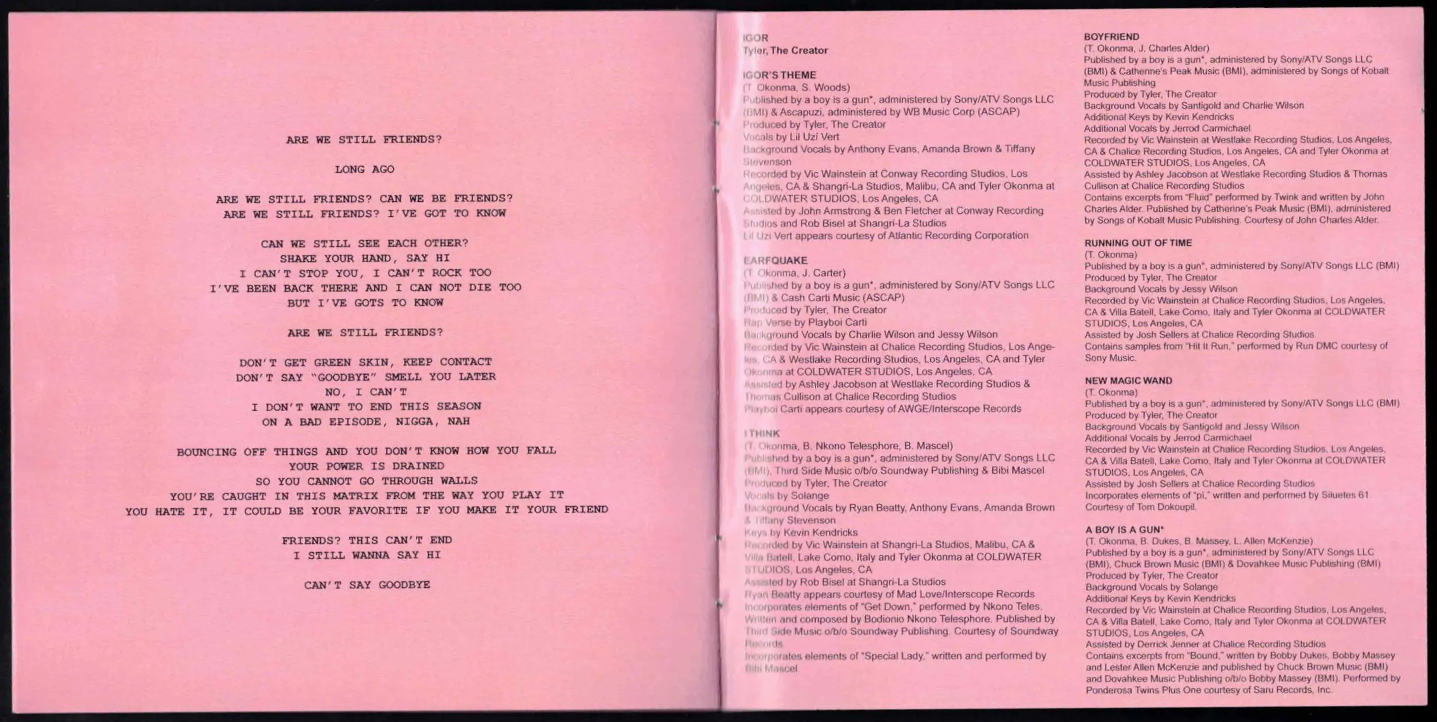
3. noticeably different
Opposed to the previous categories, these covers look stranger than they are, they arent illegible(we will get there) but they are a bit trickier to parse than the previous album covers.
Homogenic - Björk - designed by Me Company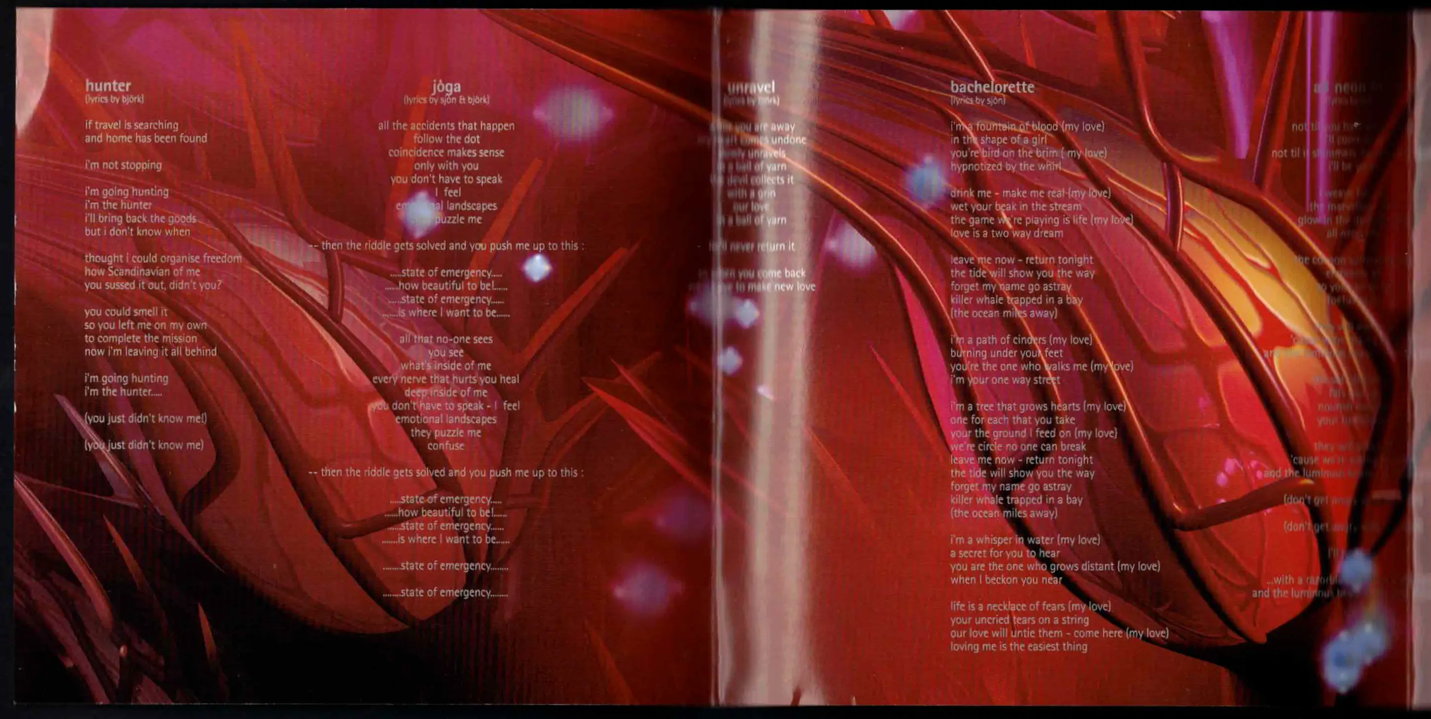 Gorgeous not-quite-accordion fold(idk what its called) with such a vibrant red and reflective silver letters. This design is so fitting for this album, but the most interesting part is that its vibrant reds, which contradicts the cold silvers of the rest of the packaging. Its this sort of warmth thats hidden inside of this album when you open it up that I really find nebulously evocative.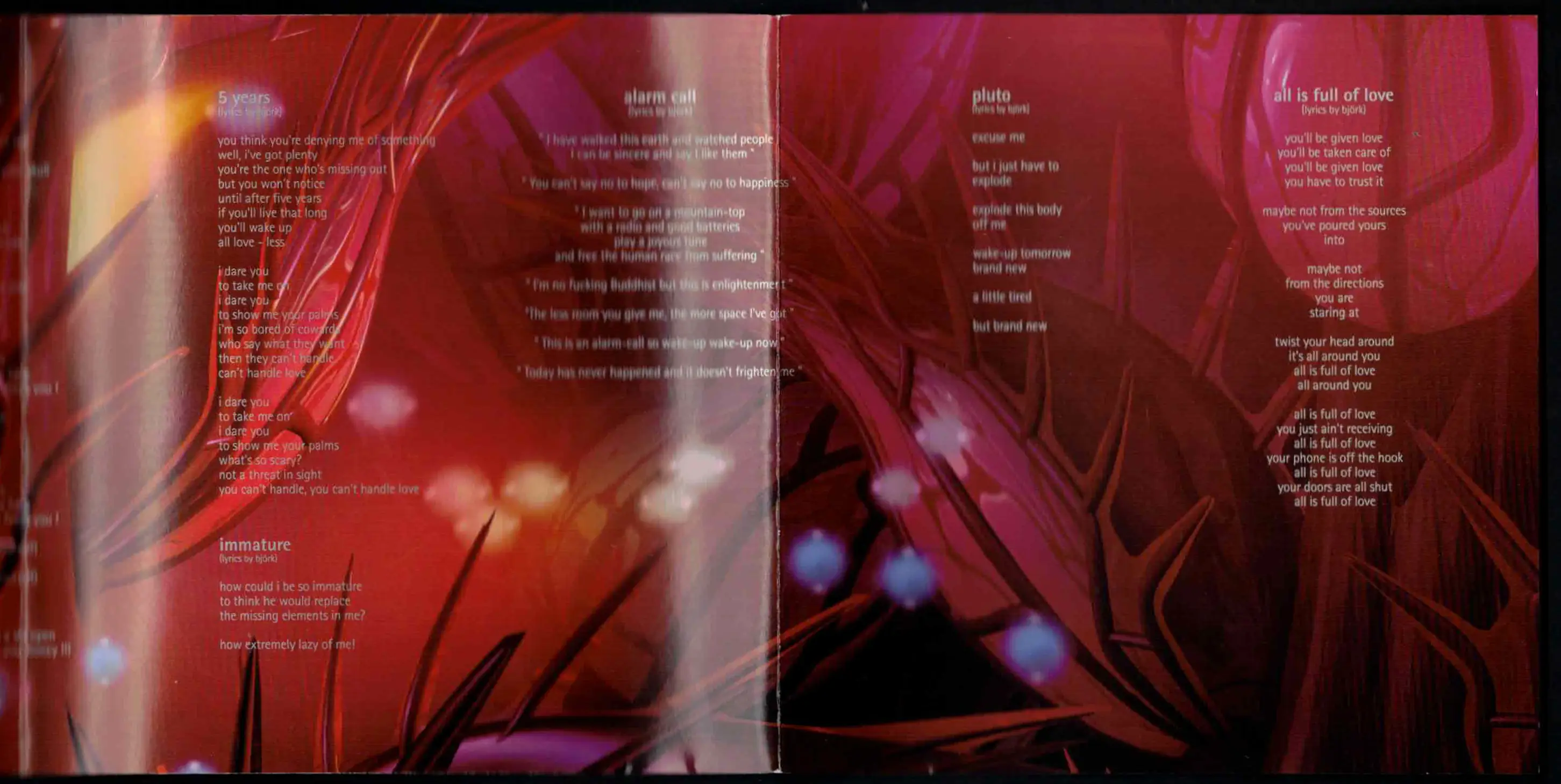
Let the Dancers Inherit the Party - Sea Power - designer unknown, presumed to be band members based off little available information
 This design looks a bit inparsible, with the beautiful lettering and text strewn around seemingly at random, but following along to the music it is very legible, this booklet is one of my favourites in my collection and its just so gorgeous and unlike anything else I've ever seen, I could look at these letters for hours on end, there is clearly so much care put into this and its just so indescribably delightful.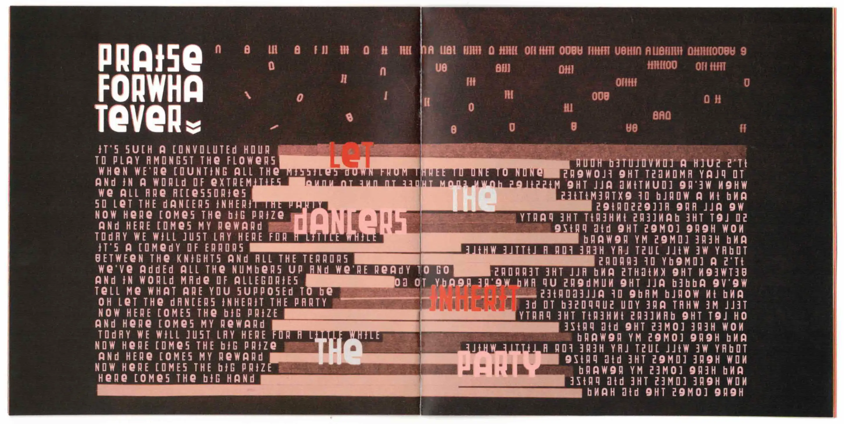
4. the ones without any lyrics in them
Its actually not unusual for an album to have an art booklet instead of a lyric booklet, so this shouldn't really be down this far in my system of organisation, but it felt right considering this was always a list of lyric booklets primarily.
Third - Portishead - designed by Marc Bessant A single ominous picture of a sub-suburb. The kind of place between suburbia and exurbia that isnt quite industrial to be called an indutrial estate but contains some form of infrastructure that connects these two. A liminal space- to use a term thats in vogue. This is where the showdown of a 90s neonoir film happens, like in Heat or Se7en. Its very simple but its doing so much for contextualising this album as something that feels cinematic but unconventially, compared to the cinematicisms of Portisheads previous works.
A Moon Shaped Pool - Radiohead - designed by Stanley Donwood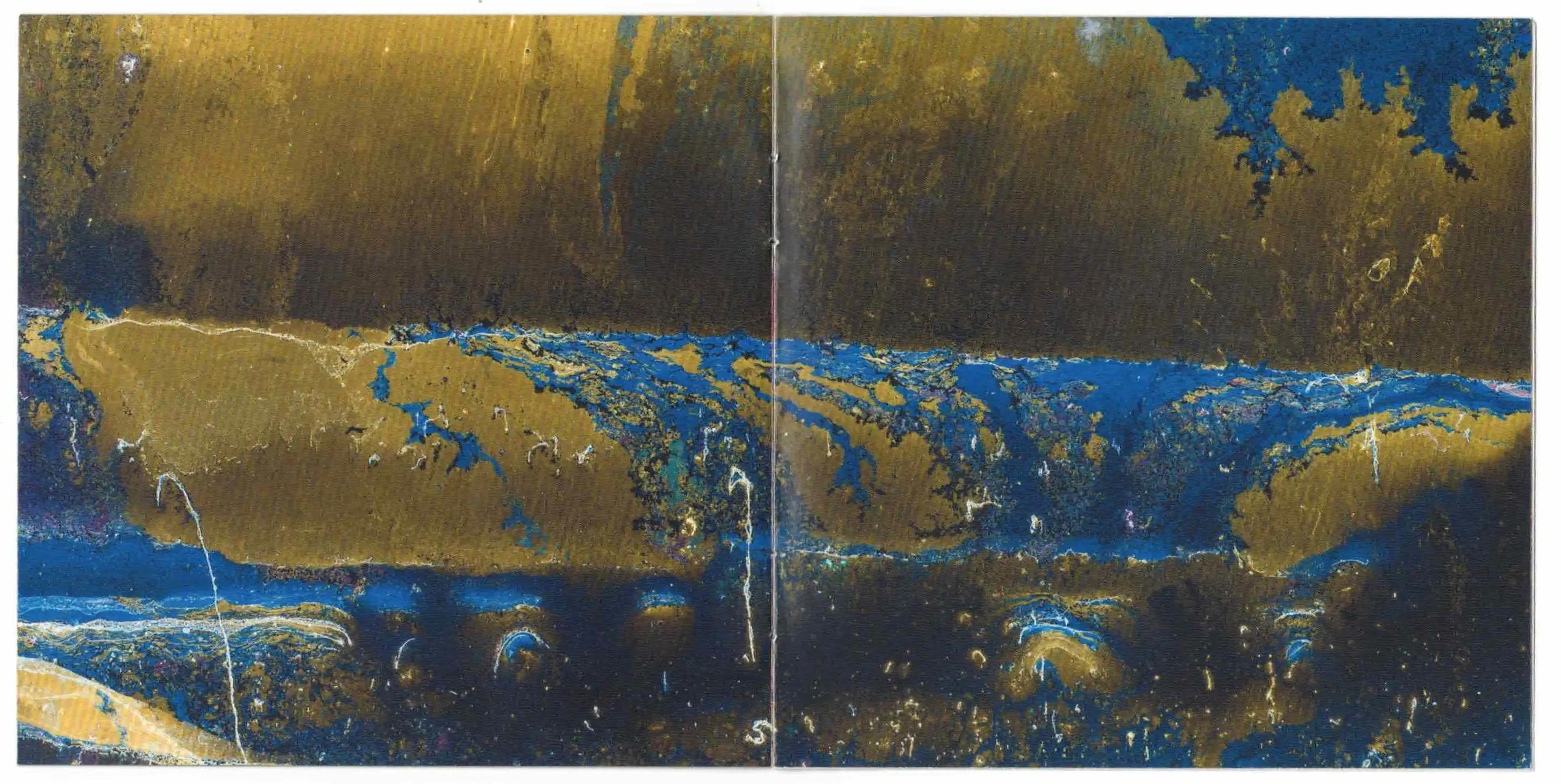
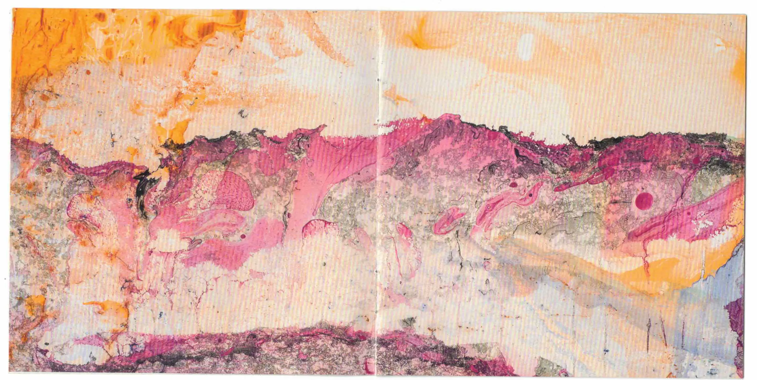 My favourite of the Radiohead art booklets, the textures here are so rich and painterly, but have this strange saturation where it isnt quite vibrant but isnt dull either(except for all the b&w ofc).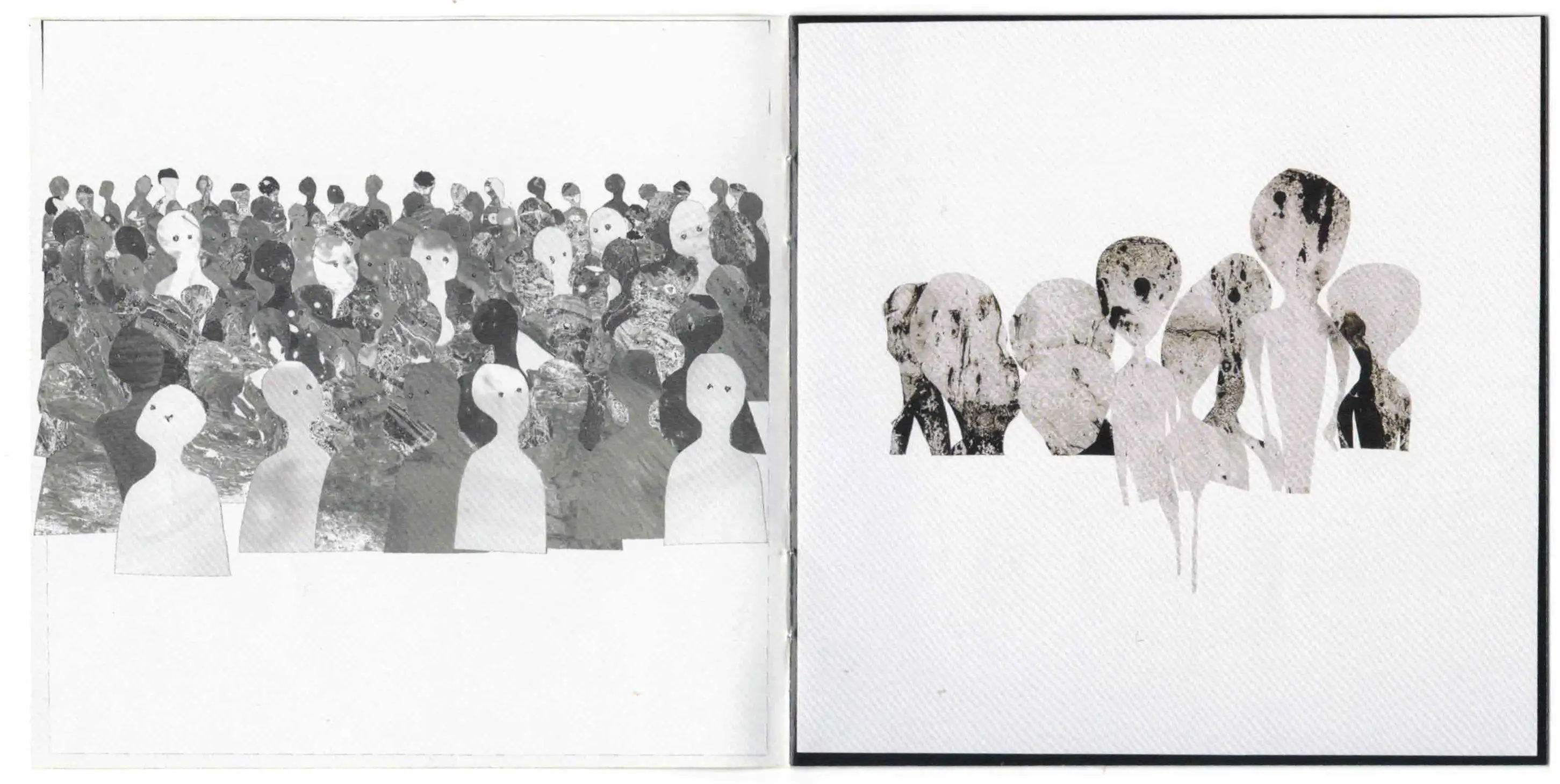
Casual Sex in the Cineplex - sultans of ping f.c. - designed by Lora Findlay Some CDs have little biographies, and I usually don't like these very much but it felt right to include one of these from my collection. I really like this one for all the archival pictures.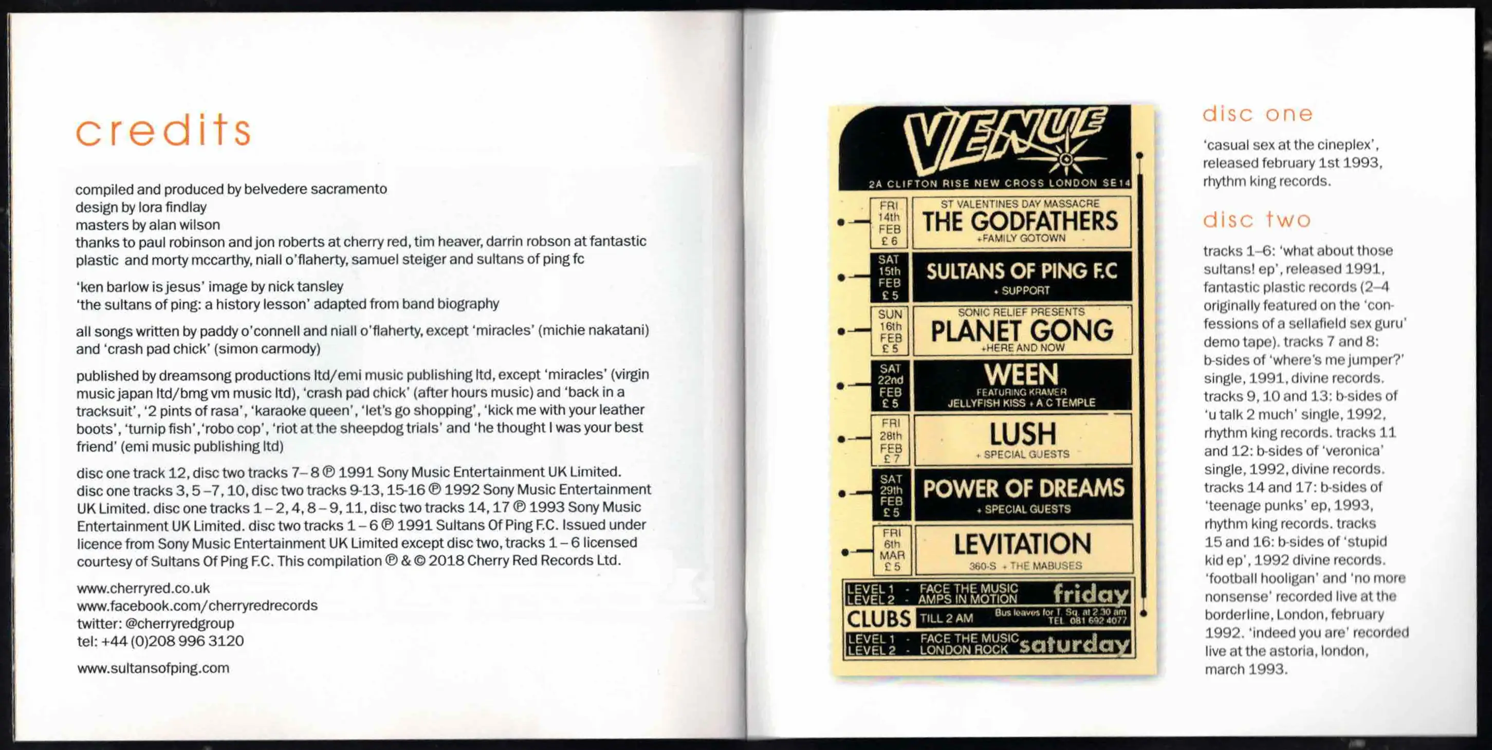
5. quasi-legible clusterfucks
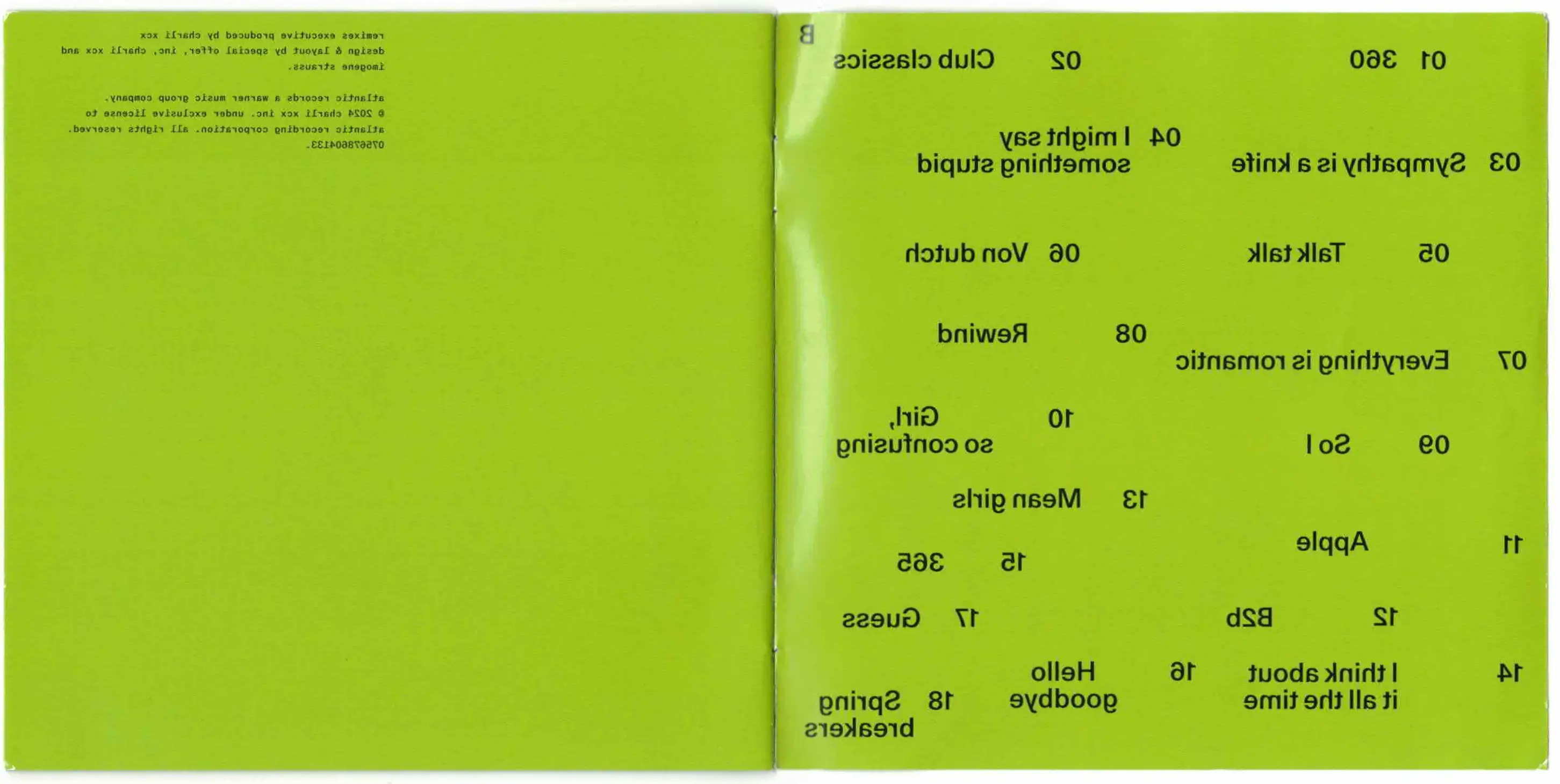
brat and its completely different but also still brat - charli xcx - designed by Special Offer inc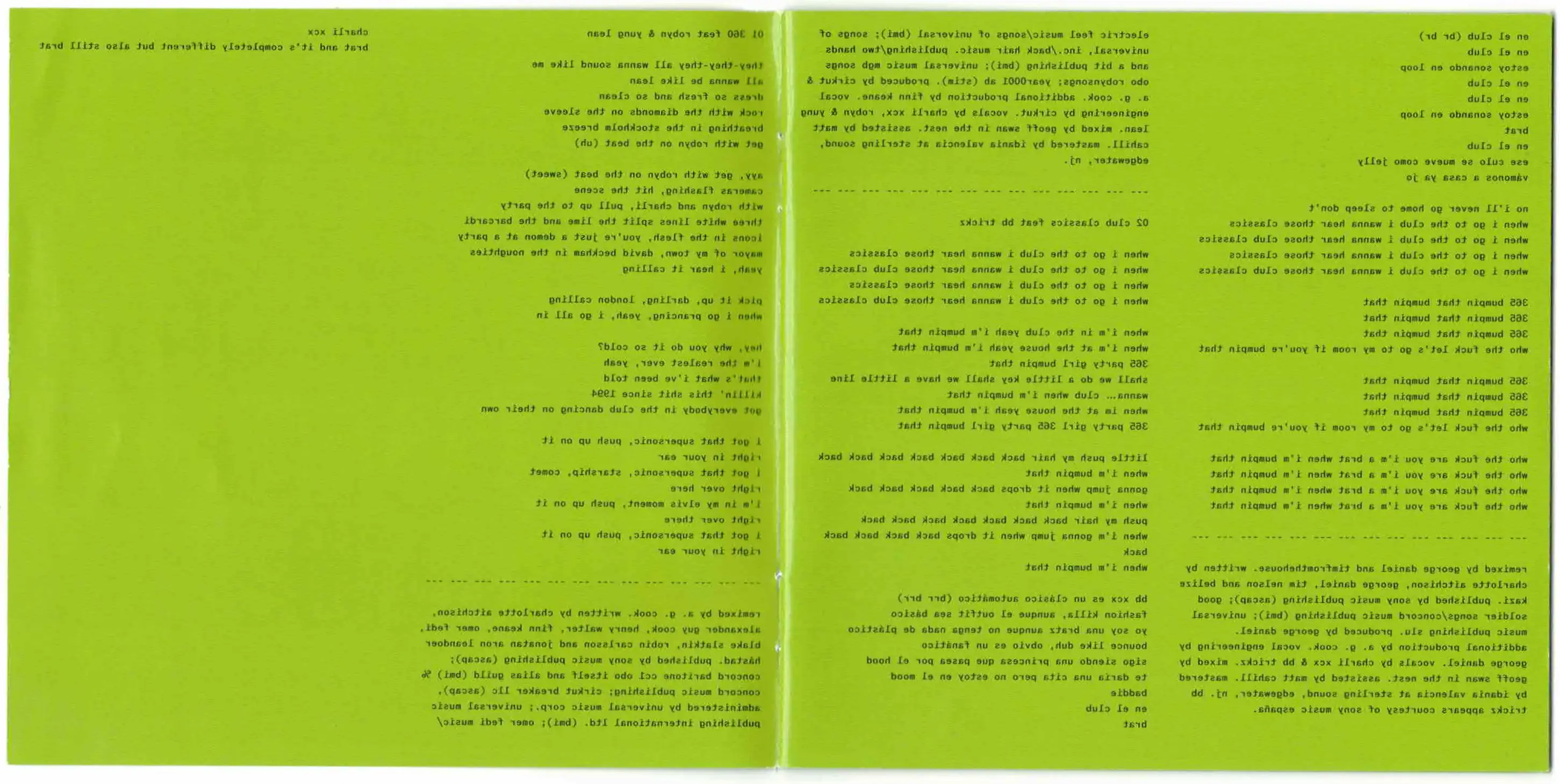 I distinctly remember opening this one up and feeling actually disgusted by it. This is what I described feeling about IGOR dialled to 11, it is equally as aggrivating and magnitudes more difficult to read. At least its consistant though, on which note I think the monospace font really works for the rhythmic and repetitiveness of dance music, especially AG Cooks layered vocals.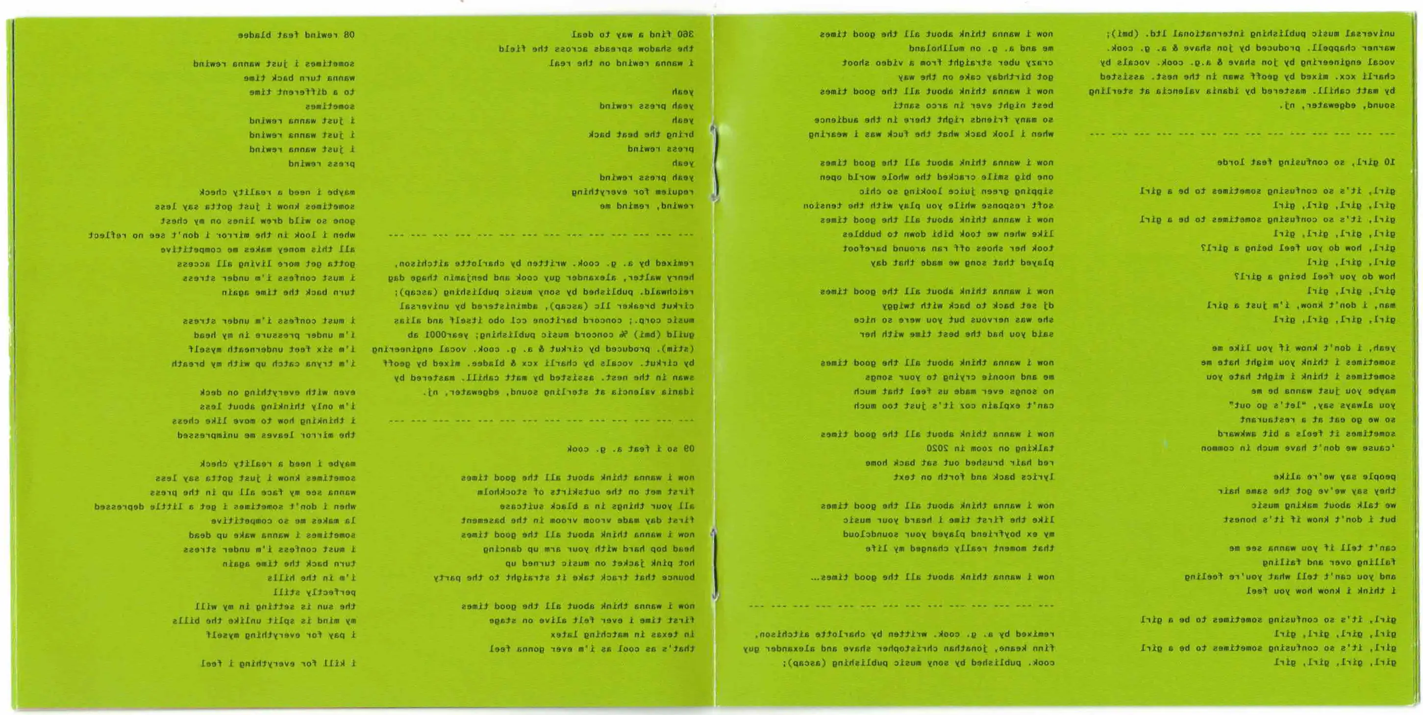
Wor$st Girl in America - Slayyyter - designer unknown to me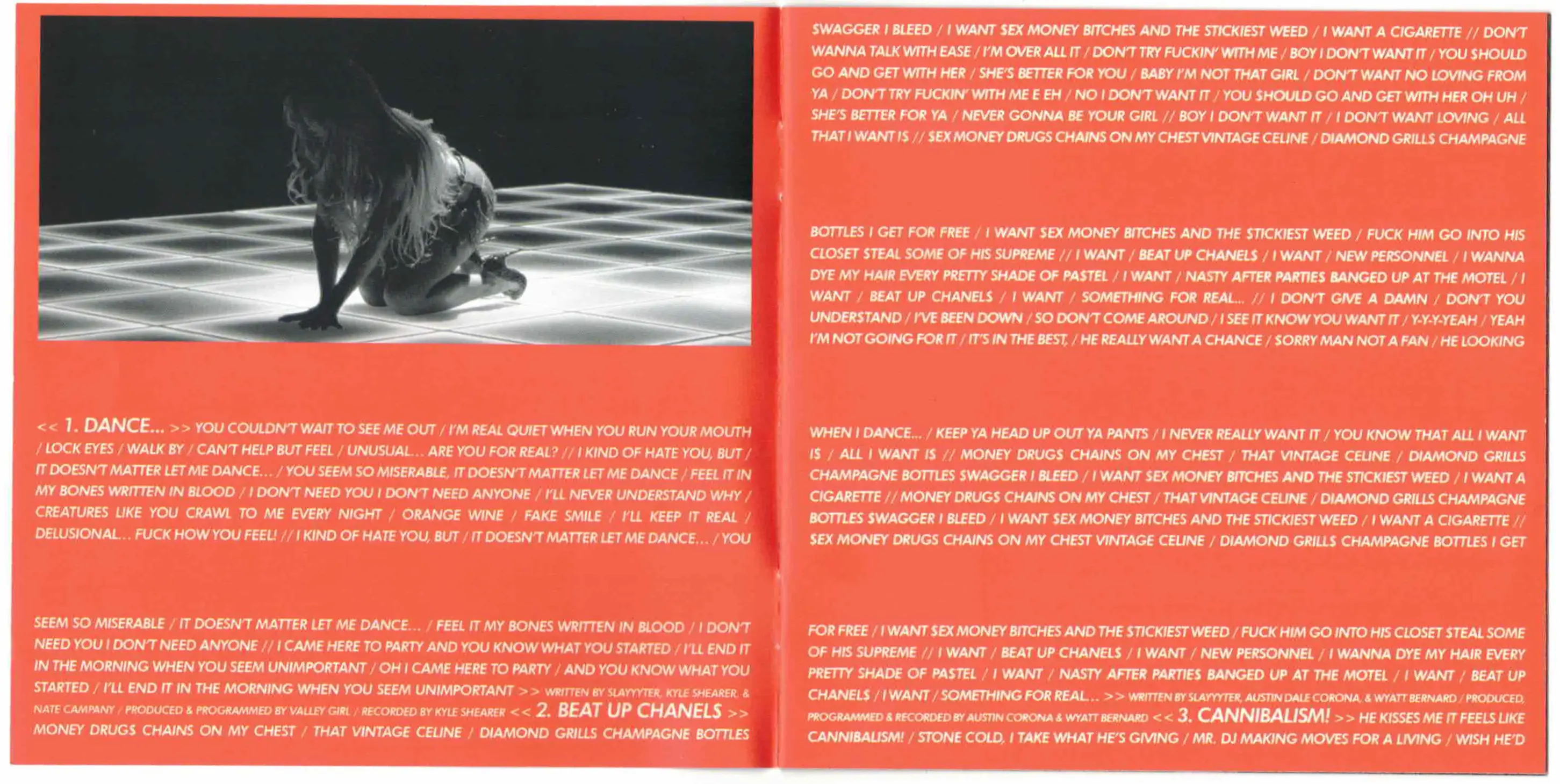
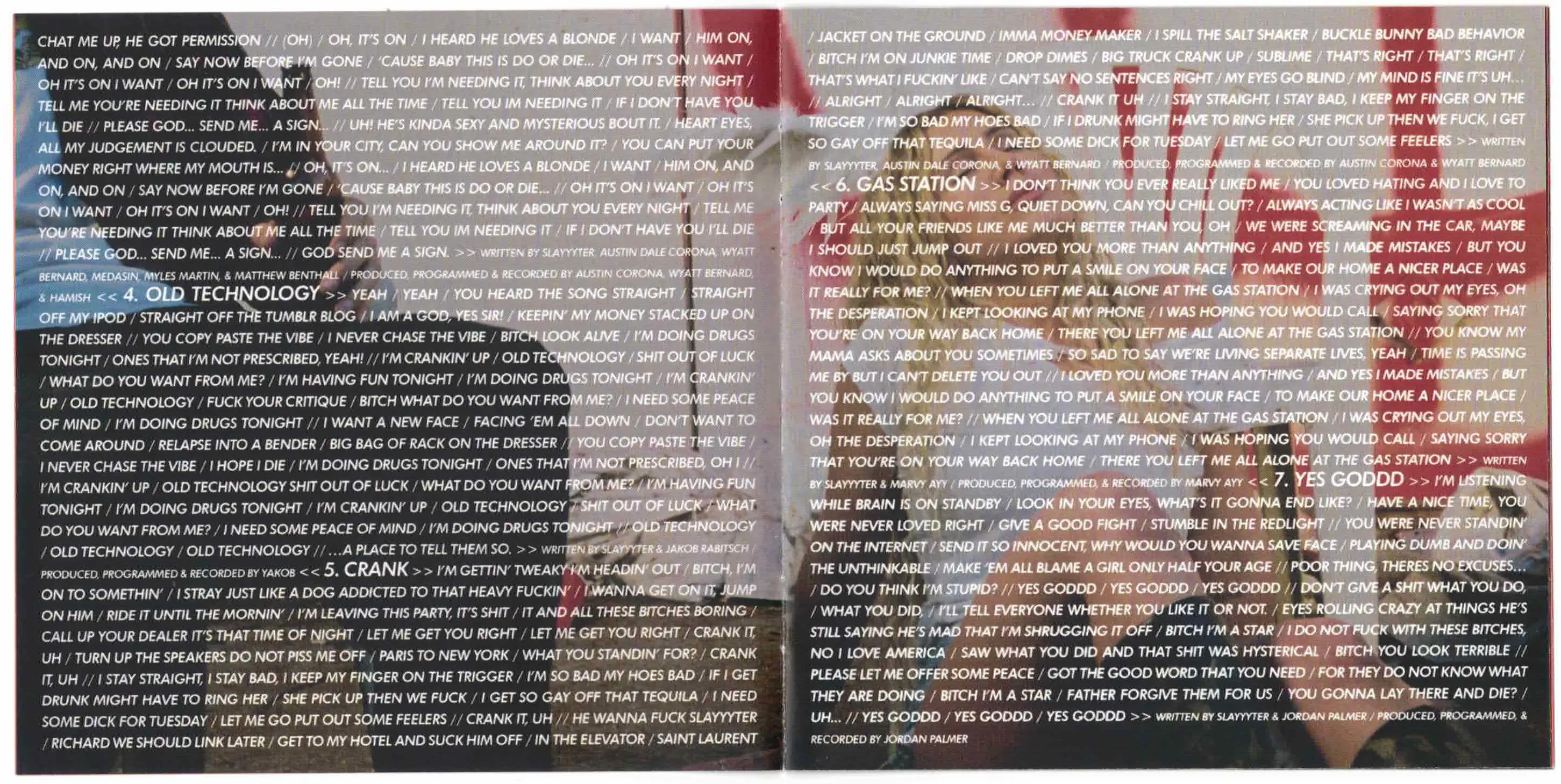 I actually picked this up yesterday, and on opening the lyric booklet, I knew this was going to be todays blogpost. It is an aggressive barrage of white text on red and black backgrounds reminiscent of Barbara Kruger or supreme(which is mentioned on the album), but where those inspirations achieve legibility, the shear amount of text in this booklet achieves the precise opposite effect while maintaining the aggressive in your face quality of the afforementioned two. It also has an extra page with an image on either side, which is fun!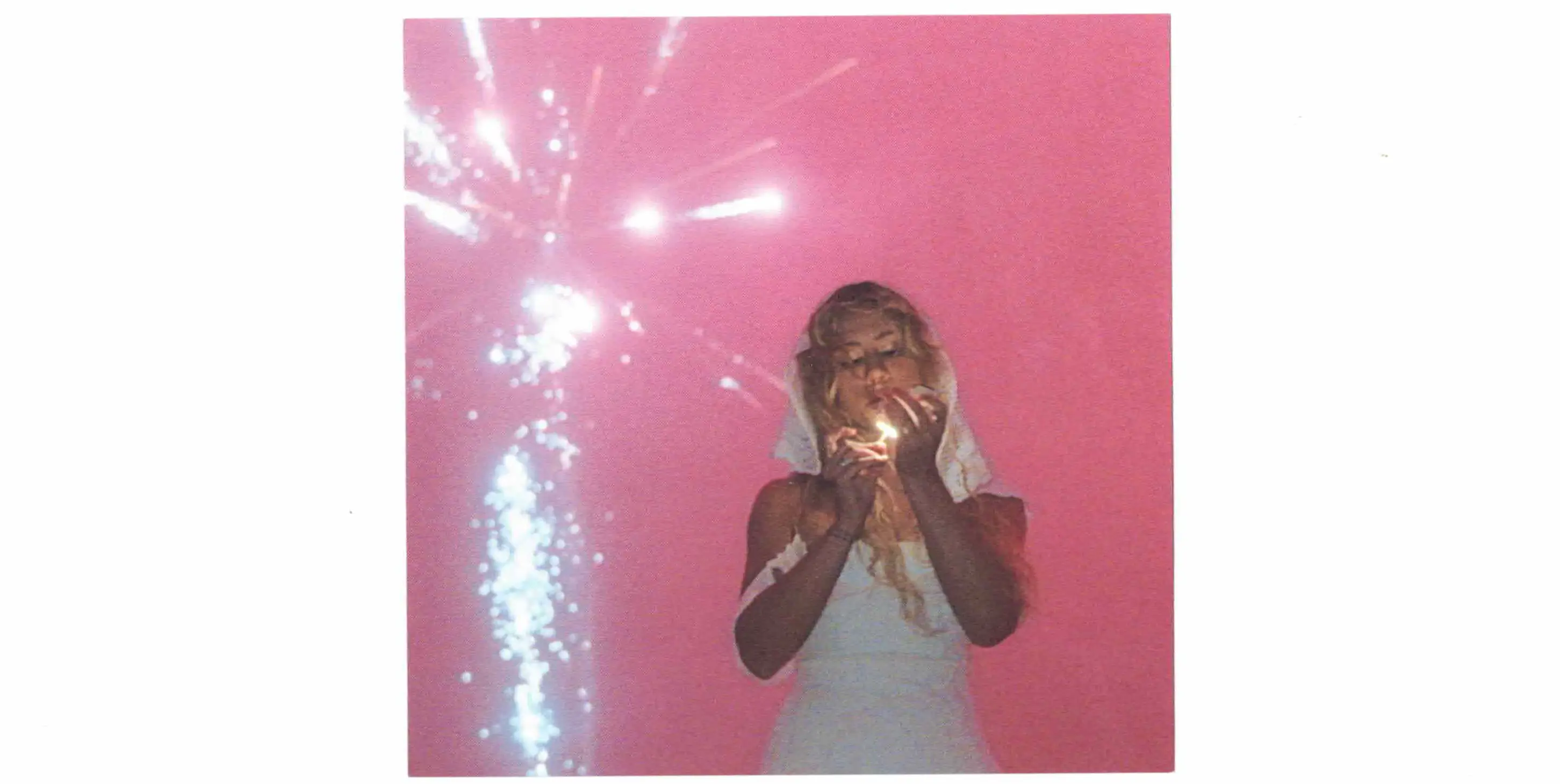
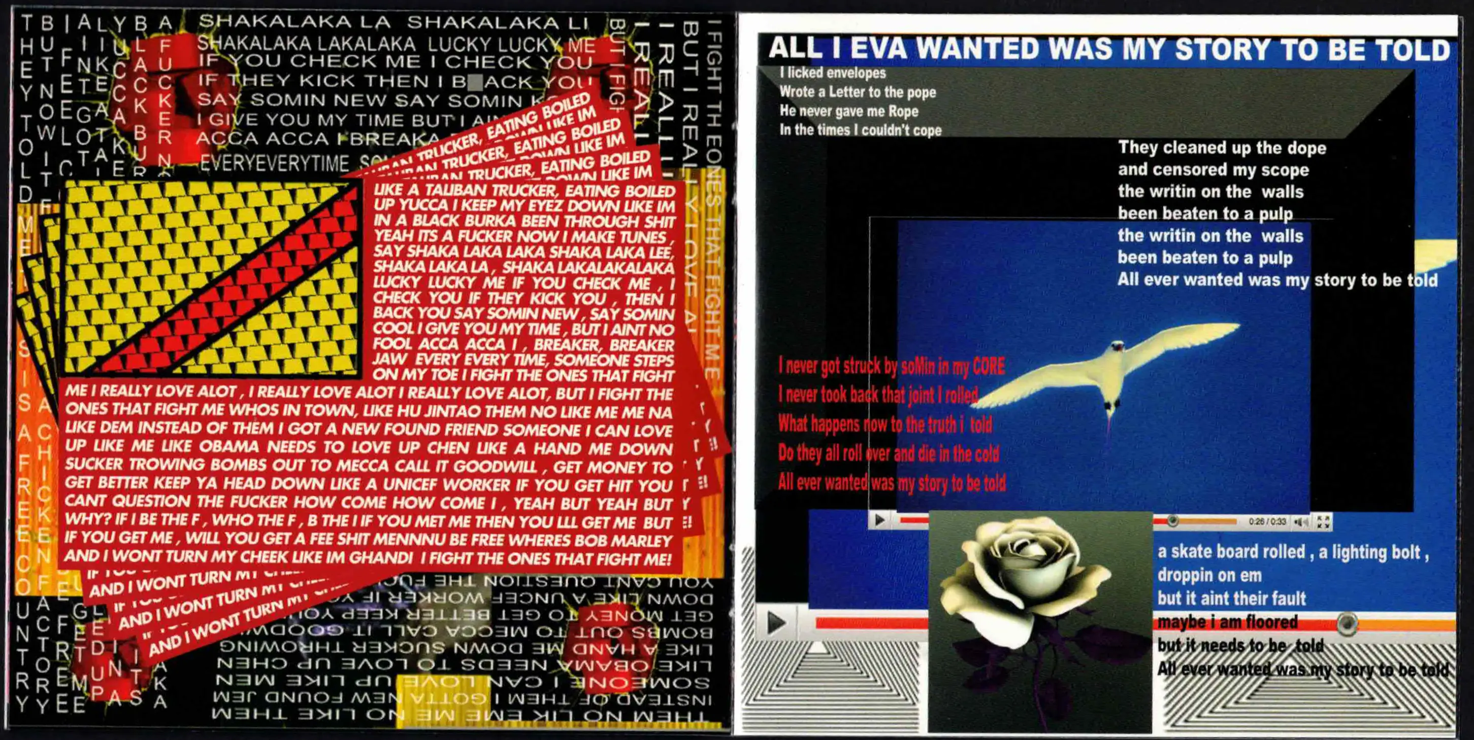
/\/\ /\ Y /\ - M.I.A. - designed by Aaron Parsons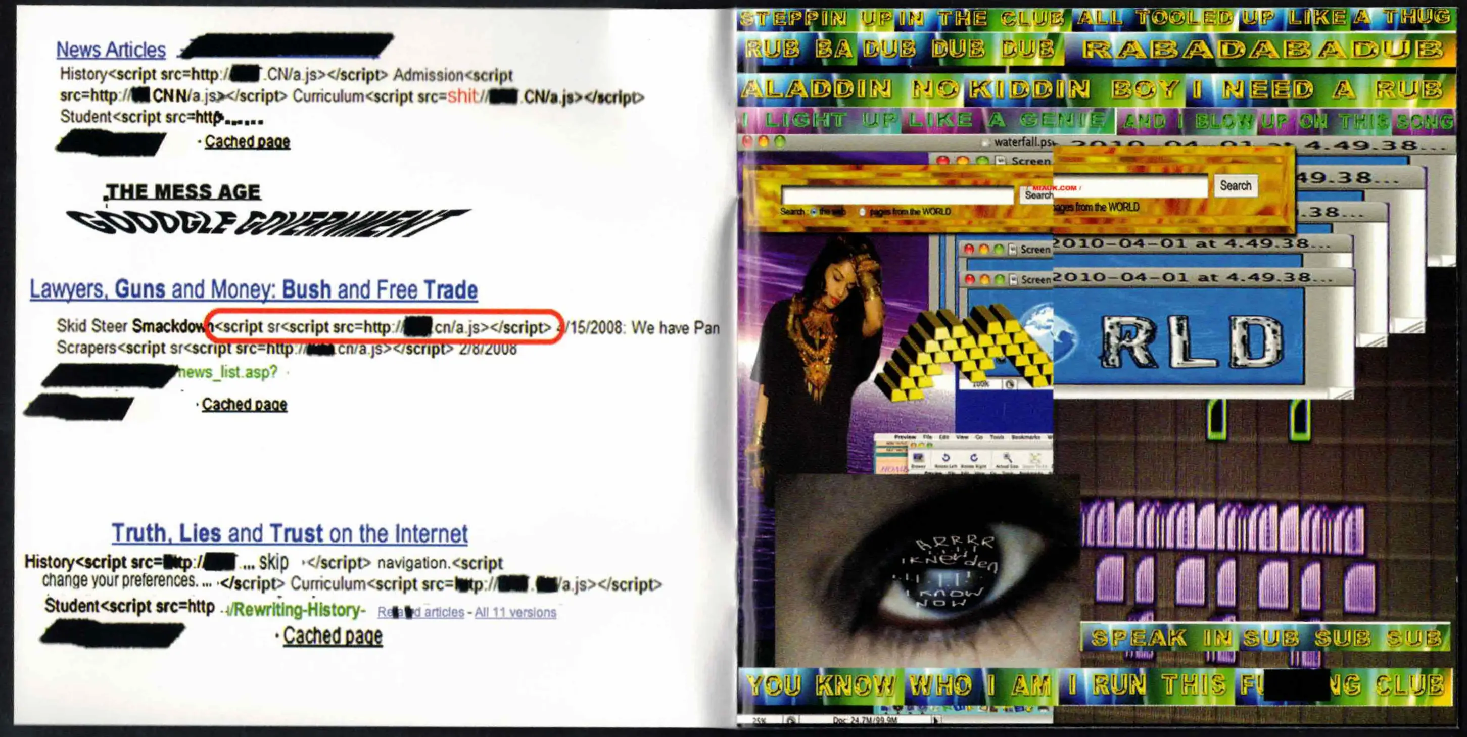 I don't even need to say anything, this is avant garde- and to think it came out 15 years ago.